
Is Your Website Optimized for Mobile Users?
Have you ever accessed a website on your phone only to find that the text is too small to read or the images are cut off? If so, then that website is not optimized for mobile users. In today’s digital age, more and more people are using their smartphones and tablets to browse the internet. This means that having a responsive design for your website is crucial in order to provide a seamless user experience.
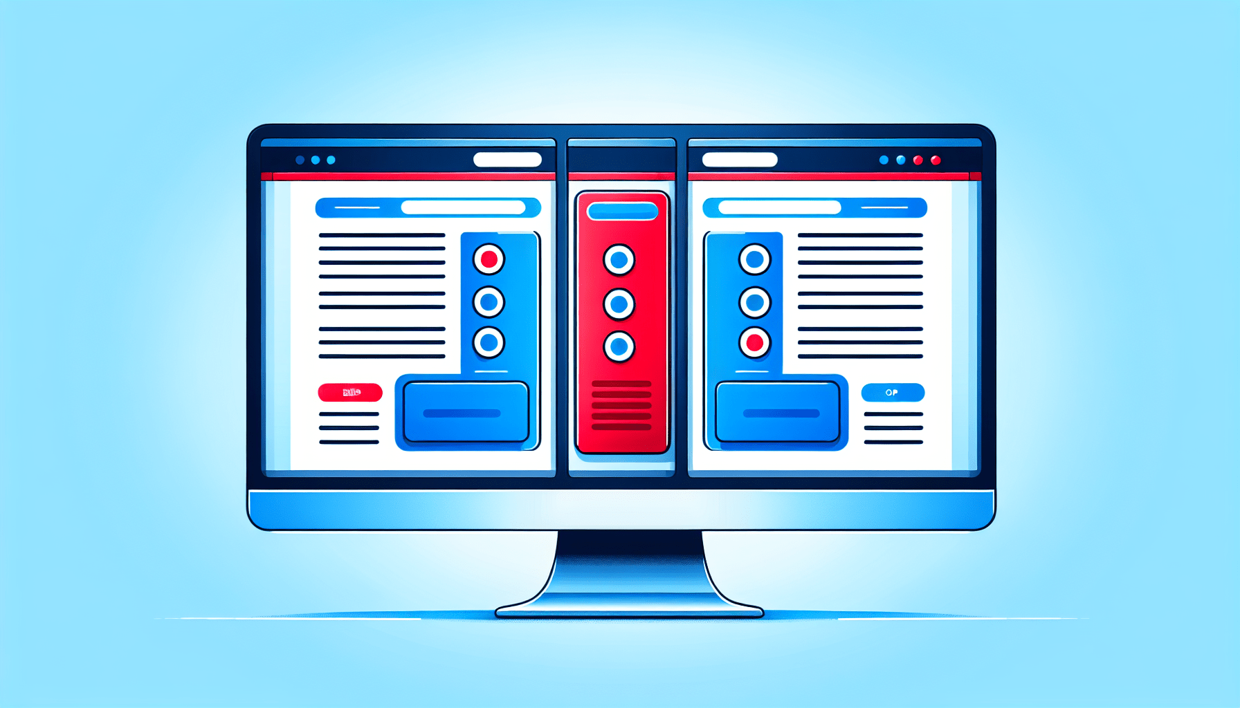
What is Responsive Design?
Responsive design is an approach to web design that makes web pages render well on a variety of devices and window or screen sizes. In other words, a website with responsive design will automatically adjust its layout and elements to fit the screen size of the device being used. This ensures that users have the same great experience whether they are viewing the site on a desktop computer, a tablet, or a smartphone.
Why is Responsive Design Important?
Responsive design is important for a number of reasons. Firstly, it improves the user experience by ensuring that visitors can easily navigate and interact with your website, regardless of the device they are using. This can lead to increased engagement and a higher likelihood of conversion. Additionally, responsive design is essential for search engine optimization (SEO). Search engines like Google prioritize mobile-friendly websites in their search results, so having a responsive design can help improve your site’s visibility and ranking.
Benefits of Responsive Design
Now that we’ve established why responsive design is important, let’s take a closer look at some of the key benefits it offers:
Improved User Experience
One of the primary benefits of responsive design is an improved user experience. By ensuring that your website is easy to navigate and use on any device, you can keep visitors on your site longer and encourage them to explore further. This can lead to increased time on site, lower bounce rates, and ultimately, more conversions.
Cost-Effective
With a responsive design, you only need to maintain and update one website, rather than separate desktop and mobile versions. This can help you save both time and money, as you won’t have to duplicate content or design elements across multiple sites. Additionally, by providing a seamless experience for users on all devices, you can reduce the likelihood of technical issues and support requests.
Improved SEO Performance
Search engines like Google prefer responsive websites because they provide a consistent user experience across devices. This can lead to improved SEO performance, as search engines are more likely to rank mobile-friendly sites higher in search results. By investing in responsive design, you can boost your site’s visibility and make it easier for potential customers to find you online.

How to Optimize Your Website for Responsive Design
Now that you understand the importance and benefits of responsive design, let’s explore how you can optimize your website for mobile users. Here are some key strategies to help you create a responsive and user-friendly website:
Use a Responsive Website Template
If you’re building a new website or redesigning an existing one, it’s important to choose a responsive website template. There are many responsive templates available that are specifically designed to adapt to different screen sizes and devices. By using a responsive template, you can ensure that your website looks great on all devices without having to do a lot of custom coding.
Optimize Images and Videos
Large images and videos can slow down your website’s loading time, especially on mobile devices with slower internet connections. To optimize your site for mobile users, make sure to compress and resize images and videos so that they load quickly and look great on all devices. You can also use responsive images and videos that automatically adjust their size and resolution based on the screen size of the device.
Prioritize Mobile Usability
When optimizing your website for responsive design, it’s important to prioritize mobile usability. This means making sure that your site is easy to navigate and use on touchscreens, with large buttons and a clear hierarchy of information. Consider the placement of important elements like menus, contact forms, and call-to-action buttons to ensure that they are easily accessible on small screens.
Test Your Website on Different Devices
Before launching your website, be sure to test it on a variety of devices and screen sizes to ensure that it looks and functions as intended. You can use tools like Google’s Mobile-Friendly Test or BrowserStack to simulate how your site will appear on different devices. Pay attention to factors like page loading speed, layout, navigation, and readability to identify any areas that need improvement.
Conclusion
In conclusion, website optimization is essential for providing a seamless user experience and improving your site’s visibility and performance. Responsive design plays a key role in optimizing your website for mobile users, ensuring that visitors can easily access and interact with your site on any device. By prioritizing responsive design and implementing best practices, you can create a user-friendly website that attracts and retains visitors, ultimately leading to increased engagement and conversions. Remember, the key to success in today’s digital landscape is to stay responsive and adaptable to the ever-changing needs and preferences of your audience.
Related Posts