
Hey, you! Want to make your website stand out from the crowd and attract more visitors? Well, you’re in luck! In this article, we’ll be taking a closer look at the common mistakes that many website owners make when it comes to optimization. From slow loading times to cluttered layouts, we’ll uncover the key pitfalls to avoid in order to ensure that your website is running smoothly and providing a fantastic user experience. So, let’s get started and transform your website into a well-optimized masterpiece!

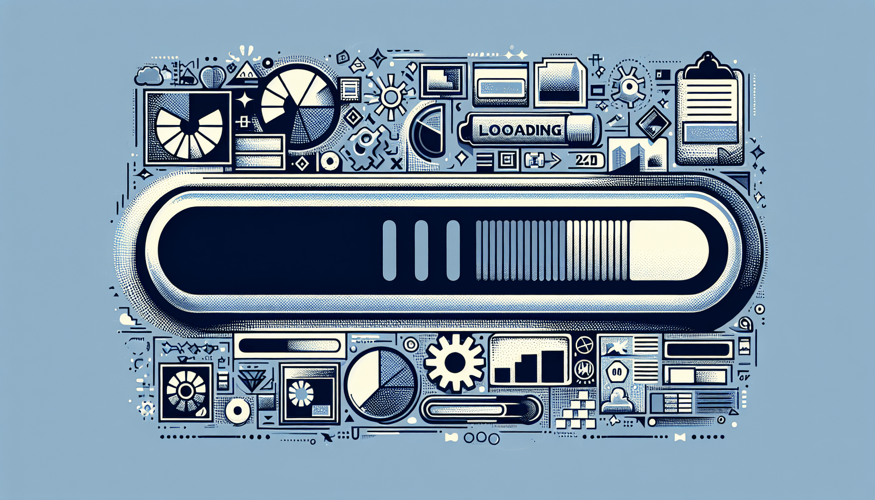
Slow Loading Times
Large File Sizes
One common mistake that can lead to slow loading times is having large file sizes on your website. Large images, videos, or other media files can significantly slow down the loading speed of your site. When users visit your website, they don’t want to wait for ages for the page to load. They want to access the content quickly and easily. By optimizing and compressing your files, you can reduce their sizes without compromising the quality. This way, your website will load much faster, providing a better user experience.
Excessive Use of Plugins
Plugins can be a great addition to your website, providing additional functionality and features. However, using too many plugins can negatively impact your site’s performance. Each plugin adds extra code and scripts that need to be loaded, resulting in slower loading times. Additionally, some plugins may conflict with each other or with your website’s theme, leading to errors and issues. It’s important to regularly review and remove any plugins that are unnecessary or unused. By minimizing the use of plugins, you can improve your website’s performance and speed.
Unoptimized Images
Images are an essential part of web design, enhancing the visual appeal and engagement of your website. However, if images are not optimized, they can significantly slow down your site. Unoptimized images have large file sizes, which take longer to load and can consume excessive bandwidth. To optimize images, you can use compression techniques, such as reducing the resolution, utilizing image formats like JPEG or PNG, and implementing lazy loading. By optimizing your images, you can ensure faster loading times and an improved user experience.
Poor Mobile Responsiveness
Lack of Responsive Design
With the increasing use of mobile devices to access the internet, having a responsive design is crucial. A responsive design allows your website to adapt and display properly on different screen sizes and resolutions. However, a common mistake is ignoring the importance of responsive design, resulting in websites that appear distorted or unreadable on mobile devices. By implementing a responsive design, you ensure that your website is user-friendly and accessible to all visitors, regardless of the device they are using.
Inaccessible Content
Another mistake that affects mobile responsiveness is having inaccessible content on your website. This includes elements that cannot be properly accessed or interacted with on mobile devices, such as dropdown menus that don’t work on touch screens or forms that cannot be filled out. It’s crucial to optimize your website’s content and functionality for mobile users by making sure all elements are easily accessible and functional on all devices.
Unfriendly Navigation
Having unfriendly navigation can also contribute to poor mobile responsiveness. Visitors on mobile devices should be able to navigate your website easily and intuitively. If your navigation menu is difficult to use, hard to locate, or has small clickable elements, it can frustrate users and lead to a negative experience. It’s important to design your website’s navigation to be mobile-friendly, with clear and easily clickable buttons or icons. This way, users can easily explore your site and find the information they need.
Lack of Clear Call-to-Action
Unclear or Hidden Buttons
A clear call-to-action is essential to guide your website visitors towards the actions you want them to take, such as signing up for a newsletter, making a purchase, or filling out a contact form. However, a common mistake is having unclear or hidden buttons that make it difficult for users to engage with these actions. Buttons should stand out visually and clearly indicate the action they represent. They should also be strategically placed throughout your website, making it easy for users to find and interact with them.
Vague or Misleading Text
Having vague or misleading text can also hinder your website’s call-to-action effectiveness. It’s important to use clear, concise, and persuasive language that clearly communicates the benefits of taking the desired action. Avoid using jargon or complex language that may confuse visitors. Additionally, avoid any misleading statements that may deceive or mislead users. By providing clear and compelling text, you can increase the effectiveness of your call-to-action and encourage more conversions.
Lack of Visual Hierarchy
Visual hierarchy is crucial in guiding users’ attention and focusing their engagement on specific elements of your website. Without a clear visual hierarchy, your call-to-action may get lost or overlooked amidst other content. It’s important to use visual cues such as size, color, and positioning to highlight and prioritize your call-to-action. Ensuring that your call-to-action stands out visually will make it more noticeable and increase the chances of users taking action.
Inconsistent Branding
Mismatched Color Schemes
Consistency in branding is essential for building recognition and trust with your audience. One common mistake is using mismatched color schemes throughout your website. Different colors create different moods and associations, so it’s important to choose a consistent color palette that aligns with your brand identity. By using a consistent and harmonious color scheme, you can create a visually appealing and coherent website that reinforces your brand identity.
Different Fonts and Typography
In addition to color, consistent typography is crucial for maintaining a cohesive brand identity. Using different fonts and typography styles throughout your website can give a disjointed and unprofessional impression. Select a set of fonts that represent your brand’s personality and use them consistently across all pages. This consistency will enhance the readability and visual appeal of your website, improving the overall user experience.
Incohesive Visual Elements
Apart from color and typography, other visual elements such as images, icons, and graphics contribute to your website’s overall branding. Using inconsistent visual elements can create a chaotic and unprofessional appearance. It’s important to establish a consistent visual style that aligns with your brand identity and use it consistently throughout your website. By ensuring visual cohesion, you can create a visually pleasing and memorable website that reflects your brand identity.
Complicated Navigation
Too Many Menu Options
Having an excessive number of menu options can overwhelm users and make it difficult for them to find what they’re looking for. It’s important to streamline your navigation menu by including only the most important and relevant options. By reducing the number of menu options, you can simplify the user experience and make it easier for visitors to navigate your website.
Confusing Menu Structure
In addition to a high number of menu options, a confusing menu structure can also hinder navigation. If your menu is organized in a non-intuitive or illogical manner, users may struggle to find the information they need. It’s essential to structure your menu logically, with clear categories and subcategories that make sense to your visitors. By simplifying and organizing your menu structure, you can enhance user navigation and improve their overall experience.
Inconsistent Placement
Another navigation mistake is inconsistently placing your menu across different pages or sections of your website. Users expect to find the menu in the same position on every page for easy access. If the menu frequently moves or changes position, it can confuse and frustrate visitors. Keep your menu in a consistent and prominent location, such as the top or side of the page, to ensure a seamless navigation experience.

Unoptimized Meta Tags
Missing or Inappropriate Title Tags
Title tags are an important aspect of SEO and search engine results. However, missing or inappropriate title tags can negatively impact your website’s visibility and search engine rankings. Each page on your site should have a unique and descriptive title tag that accurately represents the content of the page. Avoid using generic or irrelevant titles, as they won’t effectively communicate the page’s purpose to search engines or users.
Lack of Relevant Meta Descriptions
Meta descriptions are brief summaries of your web page’s content that appear in search engine results. While not directly impacting search rankings, they play a crucial role in attracting users to click on your website. A common mistake is having irrelevant or missing meta descriptions, which can lead to lower click-through rates. Take the time to write concise and compelling meta descriptions that accurately summarize each page’s content, enticing users to click through to your website.
Duplicate Meta Content
Having duplicate meta content, including title tags and meta descriptions, can negatively affect your website’s SEO. Search engines may penalize duplicate content, as it can be seen as an attempt to manipulate search rankings. It’s important to ensure that each page has unique meta content that accurately reflects its content. By avoiding duplicate meta content, you can maximize your website’s visibility and improve its performance in search engine results.
Ignored SEO Practices
Non-optimized URLs
URLs are an important element of SEO, as they provide valuable information about the content of a web page. Ignoring URL optimization can lead to lower search rankings and poor user experience. URLs should be concise, descriptive, and include relevant keywords that accurately reflect the page’s content. By optimizing your URLs, search engines and users can easily understand what each page is about and navigate your website more effectively.
Missing Alt Text for Images
Alt text is an attribute added to image tags that provides alternative text when an image cannot be displayed. This is not only beneficial for visually impaired users but also plays a role in SEO. By omitting alt text or using generic descriptions, you miss out on an opportunity to optimize your website for relevant keywords. Take the time to write descriptive alt text for each image, incorporating relevant keywords where appropriate, to improve your website’s accessibility and SEO performance.
Lack of Structured Data Markup
Structured data markup is a way to provide additional context and meaning to your website’s content for search engines. Ignoring the use of structured data markup can limit search engines’ understanding of your content and its relevance. By implementing structured data markup, you can help search engines better understand your website’s content and provide more accurate and informative search results. This can also enhance the visibility of your website in search engine results through rich snippets and other enhanced features.
Excessive Use of Pop-ups
Annoying or Intrusive Pop-ups
Pop-ups can be an effective way to engage with users and capture their attention. However, using pop-ups excessively or in an annoying or intrusive manner can harm the user experience. Pop-ups that appear immediately upon entering a website or that interrupt the user’s browsing experience can frustrate and annoy visitors. It’s important to use pop-ups sparingly and make sure they provide value to the user, such as offering discounts or providing relevant information.
Frequency of Pop-ups
Even if your pop-ups are not intrusive, using them too frequently can still negatively impact the user experience. Constantly bombarding users with pop-ups can disrupt their browsing and hinder their ability to access the content they’re interested in. Be mindful of the frequency and timing of your pop-ups, ensuring they don’t overwhelm or annoy your visitors. By finding the right balance, you can effectively use pop-ups to engage users without compromising their experience.
Lack of Clear Close Buttons
Pop-ups should always provide users with a clear and easily accessible way to close or dismiss them. Failing to include a visible close button or making it difficult to find can frustrate visitors who want to return to browsing your website. Make sure your pop-ups have prominent and easy-to-locate close buttons so that users can quickly and effortlessly close them. By providing a clear exit option, you can ensure a positive user experience and minimize any frustration.
Non-responsive Forms
Forms That Don’t Adapt to Screen Size
Forms are a crucial element of many websites, allowing visitors to submit information, make inquiries, or complete transactions. However, forms that don’t adapt to different screen sizes can be challenging for users to complete on mobile devices. It’s important to ensure that your forms are responsive and adjust to the screen size of the device to provide an optimal user experience. By implementing responsive forms, you can make it easier for visitors to fill them out, increasing form submissions and user satisfaction.
Long or Complicated Forms
Long and complicated forms can be overwhelming and time-consuming for users. If your forms include too many fields or require excessive amounts of information, visitors may abandon them before completion. Keep your forms concise and straightforward, asking for only essential information. When possible, implement progressive profiling, where visitors are asked for additional details over multiple interactions. By simplifying and streamlining your forms, you can increase conversions and improve user satisfaction.
Missing Error Messages or Validation
Filling out a form and encountering errors or validation issues without any guidance can be frustrating for users. It’s important to provide clear error messages and validation instructions to help users correct any issues and successfully complete the form. Highlighting the specific errors and explaining how to resolve them will minimize user frustration and confusion. By ensuring that your forms have proper error handling and validation, you can improve the user experience and increase form submissions.
Poor Content Formatting
Wall of Text
Presenting your content as a wall of text can discourage users from reading or engaging with it. Long paragraphs without breaks or visual elements can be overwhelming and difficult to digest. Break up your content into smaller paragraphs and utilize headings, subheadings, and bullet points to improve readability. Additionally, include relevant images, infographics, or videos to make your content more visually appealing and engaging.
Lack of Headers and Subheaders
Headers and subheaders play a crucial role in guiding users through your content and making it easier to scan and understand. Without clear headers and subheaders, users may struggle to find the information they’re looking for or lose interest in reading. Use descriptive and concise headers and subheaders that accurately represent the content of each section. This will not only improve the readability of your content but also make it more skimmable and visually appealing.
Unreadable Font Sizes
Using font sizes that are too small or too large can make your content difficult to read and discourage users from engaging with it. It’s important to choose a font size that is easily readable on different devices and screen sizes. Consider the typical viewing distance and adjust the font size accordingly. Additionally, use a font type and style that is clear and legible. By ensuring readable font sizes, you can enhance the accessibility and user experience of your content.
In conclusion, optimizing your website is essential for providing a positive user experience and maximizing your online presence. By avoiding common mistakes such as slow loading times, poor mobile responsiveness, lack of clear call-to-action, inconsistent branding, complicated navigation, unoptimized meta tags, ignored SEO practices, excessive use of pop-ups, non-responsive forms, and poor content formatting, you can create a user-friendly and effective website that attracts and engages your audience. Remember to regularly review and update your website to ensure it remains optimized and aligned with your business goals.
Related Posts

Dos And Don’ts Of Website Creation For A Smooth User Experience
What Is Reseller Hosting?
Website Security Vs. Performance: Finding The Right Balance